Youtube remixes are due emailed to Clint by Wednesday, April 4 at 5pm! clintsleeper "@" gmail.com
Workshops: Tuesday and Wednesday @ 11 am.
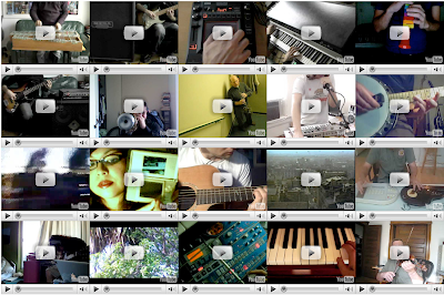
You will be developing a webpage as a multichannel video/audio work inspired by the In Bb 2.0 as available online: http://www.inbflat.net

Workshops: Tuesday and Wednesday @ 11 am.
You will be developing a webpage as a multichannel video/audio work inspired by the In Bb 2.0 as available online: http://www.inbflat.net

Your project is to have at minimum no less than 5 videos to mix. You
can duplicate the format as in the "inbflat" project, using 20 videos
or use no less than five videos to mix.
Examples:
You are making a video remix, net art project, imagine someone coming to your webpage and randomly clicking on your videos to create a unique, live montage of videos and sound.
There are a wide range of possibilities and variables to consider as you develop these pieces. You are the director! Consider all aspects of creating this piece.
This includes:
-change the background color (THIS IS REQUIRED)
-change the title text on the page (THIS IS REQUIRED)
-The shape of your grid?
-Color or tonality of your videos in the grid (all black and white, all towards one color spectrum, light, dark, day, night?)
-Camerawork - all hand held? All from tripod? All zooming? All panning left to right or up and down? Or some combination?
-What or who is your subject and why?
-What is the sound or sounds either repeated or different for each video?
-subject matter – this is of course up to you - the video sources will come primarily from videos you create and upload to youtube. These are to constitute no less than 2/3rds of your project. You may use appropriated videos from youtube but these must be used sparingly - no more that 1/3rd of your videos may be from existing youtube sources. (these are general guidelines of course, if you use 5 videos total, at least 3 must be of your making for example).
-techniques - you will be learning some basic html coding with this project while using Dreamweaver for basic production.
-sound – for this piece you have you may have up to 20 audio channels interacting and mixing in real time! These can be all different or repeats of the same audio/video. Choose carefully as the mix of sound is very important to this project.
Youtube remixes are due emailed to Clint by Wednesday, April 4 at 5pm! clintsleeper "@" gmail.com
Follow these instructions carefully BEFORE sending these to Clint!
-CHANGE THE NAME OF THE index.html file that I will send to your name as follows: Save the file with your name on it EXACTLY as follows: john_smith.html
He will upload these to the Digital Media area website from where you can link this to your blog. You must also take a screen grab of your entire remixed work and post this to your blog, link this image to your remix project once the associated web page is finished.
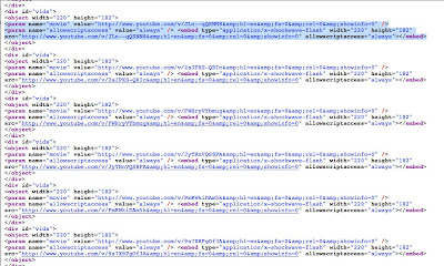
EXAMPLE - replace the highlighted code with the embed you cut from your chosen youtube video. Remember to use the OLD YouTube embed codes:


