Sunday, April 22, 2012

Final Project: Second Life Avatars

                             (Digitally Beautiful or Weird Harry Potter?)
Due Monday, May 14, 10:15am - 12:15pm - 
We will hold our final class meeting in Second Life!
As you all know, our final project will consist of the creation of two avatars in Second Life. We will start with a tour of Second Life locations with Joseph Delappe, head of the Digital Media Department, as our Docent. Also, Clint will be giving us a workshop on how to get things done in Second Life. The "Community Learning" idea is a theme we have followed through out the semester and will, of course, be continued in our final project. Think of the project as a mixture of the traditional self-portrait and social practice new media art. Please check out this Front Line "Digital Nation" (I believe its on Netflix too) to start thinking about the digitalization of various aspects of our lives.

Part 1: First Self
Representational Avatar/Self
If you haven't done so already, sign up for a free account and get acquainted with Second Life. Your first avatar will be representational and reflective of who your are in real (or meat) space. Look above to see mine as an example.

Follow these steps:
A) Begin by playing with the appearance interface to get accustomed to playing in Second Life. Play with eye color, body shape, etc. to build your digital self. You will need to find, create, or buy (I'll give you some SL cash called Lindens) clothing and accessories to create a realistic avatar. Think of the Second Life tools as just another medium used to create human representations.

Below is a tutorial that will help you get comfortable playing with your appearance.
http://wiki.secondlife.com/wiki/Appearance_Editor

B) Once you have created an avatar, save this as an outfit. The next step is to use Photoshop to create a "photo" realistic avatar. I've included tons of tutorials and the avatar template I used to create my beautiful self. Like everything related to Digital Media, it looks harder than it really is. You will start by taking a profile and front head shot to work with in Photoshop. Make sure these are taken together so the light is consistent. You will use these photos as source material to build your portrait with a Master Template. Remember, patience and  the Clone Stamp Tool are your best friend in this project.

Here is the main tutorial page for clothing and skin tutorials:
http://wiki.secondlife.com/wiki/Clothing_Tutorials

I used this link to create my avatar. Her website is full of helpful tutorials on all sorts of fun subjects:
Robin Wood

Here are some files that I used in my process.
This is the final result using the template I downloaded from Robin Wood. Remember to hide the template layers before saving your file as a .tga.


                                                                   Mugshot!

Its easier to only work with one half of your source photo to make your portrait have symmetry.

Below is the template Joe used to create his senator candidate avatar:
http://www.annotoole.com/CMFF/ (you will need CMFF_Master_Template_Head.zip)

This is a tutorial on making and importing skin. The version of SL used is old but the tutorial gives you a good sense of how to think about the process of creating your portrait:
http://www.avatars-3d.com/tutorial-template-secondlife/273-second-life-how-to-use-a-skin-template

Though the artist is using a different program in this video, the process you can use is the same. Its helpful to watch this as it quickly gives you tips on how to successfully use your tools to create your avatar.

http://www.youtube.com/watch?v=PHQKQKQROyc&feature=related

We will meet in Second Life next week for a trial run of our avatar critiques. We will discuss the success of your avatar and what you can do to improve it for the final critique on April 14. Like Dylan said, this should be fun and somewhat of a digital party. I hope it is the funnest final you have this semester. Also, remember what I told you about flexibility and patience with each other for this project. The success of the critiques will rely on us working as a community and sometimes Second Life can be poopy in how it loads, functions, whatever. Good screen shots posted to your blog are vital for this project.


Part 2 – Second Self
For the second part of this project, you will create a "fantasy/experimental/imaginary" avatar. Your imagination is the only limit for the second avatar. Consider the variety of ways you can express your inner-self, your interests, or any way you would like to represent yourself. One requirement of this project is that at least one of the items of clothing or objects used for your outfit are made using the building tools in Second Life.

Remember the Google Rule when tackling this project and have fun. Really use your imagination and artistic creativity with this piece.

Some Additional Links for Tutorials!
A TON of tutorials here, please note "how to embed texture onto an object" for example:

Clothing Tutorial:

Importing Textures: Important for importing your portrait texture.

Build stuff:

Sunday, April 8, 2012

Projects #7 Crowdsourcing!


Crowdsourcing!
Projects due and Critique: April 23, 1pm!

This project explores the creative possibilities of "crowdsourcing" - inviting you to take advantage of the opportunity to participate in three unique "crowdsourcing" art projects online and to conceive of a proposal for your own crowd sourcing project.

What is crowdsourcing? 

From Webopedia:
A slang term used to describe the practice of using both the skills and time of underpaid — or unpaid — amateurs to create content or solutions for established businesses. Basically, crowdsourcing means to "use talents of the crowd", and is a play on the word outsourcing. The origins of the word crowdsourcing are credited to Jeff Howe, a Wired Magazine writer who first brought crowdsourcing to people's attention and vocabulary with his 2006 story, "The Rise of Crowdsourcing".

READ THIS FOR DISCUSSION NEXT WEEK:
http://www.csmonitor.com/The-Culture/Arts/2011/0114/Crowdsourcing-The-art-of-a-crowd

-AND-

Pages 111-124 Participative Systems from Rethinking Curating (pdf file will be emailed to you!)

Develop TWO questions for discussion - one for each reading!

Part 1: Choose THREE of the following and participate! Fully document your participation and provide appropriate links, images and writing on your blog posting for your final project effort:

1) Upload a video segment to the online video/film collaborative experiment, Man With A Movie Camera: The Global Remake http://dziga.perrybard.net/

2) Create a photo essay to submit to the Collected Visions project: http://cvisions.nyu.edu/mantle/info.html

3) Participate in The Johnny Cash Project http://www.thejohnnycashproject.com/

4) Create a proposal for the iraqimemorial.org project: http://www.iraqimemorial.org

5) Participate in the Young Me/Now Me project: http://www.zefrank.com/youngmenowme/ 


6) Revisit the past with Dear Photograph: http://dearphotograph.com/

Part 2: What if you were to make a crowdsourcing art project? What would it be? This is your challenge! Come up with an original crowdsourcing art project and create a design for an imagined home page. Think carefully about the idea of crowdsourcing art - please don't simply copy what has already been done (for instance, don't take a Lady Gaga song and do the Johnny Cash Project). Come up with something original. It can be funny, political, change the world? Be creative! Post your website homepage design and concept for this original crowdsourcing art project concept to your blog!

You are expected to expand upon what you have learned over the course of the semester in terms of your technical and conceptual growth. Do not choose simply what looks to be the “easiest” path to engaging these online crowdsourcing projects or in developing your own concept! Challenge yourself by conceiving an approach to these projects that will present you with new possibilities to advance your capabilities and thought processes as an artist! Projects are graded considering the complexity of concept, technical execution and the apparent level of difficulty in regard to what you choose to do! Good luck and have fun!

Projects due and Critique: April 23, 1pm!

Crowdsourcing Links:
http://www.wired.com/techbiz/media/news/2007/07/crowd_captain
http://mashable.com/2010/11/06/crowdsourced-art-projects/
http://kk.org/ct2/2009/07/crowdsourced-music-video.php
http://www.crowdsourcing.org/video/eric-whitacres-virtual-choir---lux-aurumque-/2881
http://www.starwarsuncut.com/
http://www.learningtoloveyoumore.com/

Lynda

Here is a website full of tutorials to learn a variety of software. I will email you the UNR access codes.

http://www.lynda.com

Monday, April 2, 2012

Writing and Presentation Assignment


1) This is a two part final assignment.  You will be creating a 5 to 7 minute presentation for class and a 1500 word Illustrated Blog Post/Paper on the same subject matter.

2) Choose two artists (or artists groups/collaboratives) from the following websites featuring literally hundreds of artists for you to explore.  You are to choose artists we have not covered in class:
http://www.eyebeam.org/people/current (search through "fellows" and "residents" for hundreds of amazing artists, links to their websites will generally be on their profile pages)
http://userwww.sfsu.edu/~infoarts/links/wilson.artlinks2.html
http://en.wikipedia.org/wiki/Electronic_art
http://rhizome.org/art/
http://www.gamescenes.org/

2) Research your chosen artists. Make sure to record citations of where to find the works, links, etc.

3) Choose ONE representative work from each of your artists for a total of two works to be considered in your paper and presentation - you may choose to include more works by these artists in your visual presentation to the class.

4) Describe, analyze, interpret, compare and contrast the artist’s works, considering broadly their chosen formal and conceptual strategies, being careful to address genre (film, video, performance, interactive art, simulation, game art, etc) in your general analysis of the works. As part of your research, make an attempt to contact both of your artists to ask questions regarding the work. (If you don't hear back from them please note such in your paper and presentation). You need to reference the readings from the class when completing both parts of the research project. For the paper/blog post, make appropriate citations following standard academic paper guidelines (MLA or Chicago Manual Style)

Please limit your chosen artists/works to those created after 1980 - the only requirement is that the artists are somehow intrinsically involved in the creative use of digital technologies in their works.

The intent here is to give you the opportunity to critically engage in basic research and analysis of artists and artworks while at the same time encouraging a greater depth of experience of various artist’s creative production and contexts.

The paper is to be in the form of an extended blog post - include illustrations, videos where appropriate, etc.

Here are some online resources to help you in considering how to critique, compare and contrast your chosen artist's works:
http://clackhi.nclack.k12.or.us/~edgintonwWeb/page%20files/Critiquing_Writing%20about%20art.htm
http://www.unc.edu/depts/wcweb/handouts/comparison_contrast.html
http://projects.uwc.utexas.edu/handouts/?q=node/15

Grading:
Your presentation and writing will be graded according to the quality of your research, the originality of your analysis, the clarity of your writing, design and clarity of your presentation.

Due Dates:

In Class Presentations (chosen at random)
Monday, May 7th
Kelli
Austin
Kelsey
Bryan
Jessica
Bret
Christen
Fantasia
Katie
Aimee
Nicole
Dylan
Sarah
Jason
Sam

Paper as Illustrated Blog Post:
Posted by: Wednesday, May 9th Midnight

Monday, March 26, 2012

Project # 6 YouTube Mixer

Youtube remixes are due emailed to Clint by Wednesday, April 4 at 5pm! clintsleeper "@" gmail.com

Workshops: Tuesday and Wednesday @ 11 am.


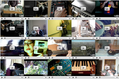
You will be developing a webpage as a multichannel video/audio work inspired by the In Bb 2.0 as available online: http://www.inbflat.net


Your project is to have at minimum no less than 5 videos to mix. You can duplicate the format as in the "inbflat" project, using 20 videos or use no less than five videos to mix.

Examples:

You are making a video remix, net art project, imagine someone coming to your webpage and randomly clicking on your videos to create a unique, live montage of videos and sound.

There are a wide range of possibilities and variables to consider as you develop these pieces.  You are the director!  Consider all aspects of creating this piece.

This includes:

-change the background color (THIS IS REQUIRED)
-change the title text on the page (THIS IS REQUIRED)
-The shape of your grid?
-Color or tonality of your videos in the grid (all black and white, all towards one color spectrum, light, dark, day, night?)
-Camerawork - all hand held?  All from tripod?  All zooming?  All panning left to right or up and down?  Or some combination?
-What or who is your subject and why?
-What is the sound or sounds either repeated or different for each video?

-subject matter – this is of course up to you - the video sources will come primarily from videos you create and upload to youtube.  These are to constitute no less than 2/3rds of your project.  You may use appropriated videos from youtube but these must be used sparingly - no more that 1/3rd of your videos may be from existing youtube sources.  (these are general guidelines of course, if you use 5 videos total, at least 3 must be of your making for example). 

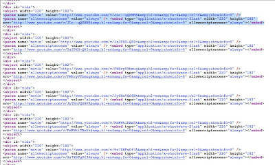
-techniques - you will be learning some basic html coding with this project while using Dreamweaver for basic production.

-sound – for this piece you have you may have up to 20 audio channels interacting and mixing in real time! These can be all different or repeats of the same audio/video. Choose carefully as the mix of sound is very important to this project.

Youtube remixes are due emailed to Clint by Wednesday, April 4 at 5pm! clintsleeper "@" gmail.com

Follow these instructions carefully BEFORE sending these to Clint!

-CHANGE THE NAME OF THE index.html file that I will send to your name as follows: Save the file with your name on it EXACTLY as follows: john_smith.html

He will upload these to the Digital Media area website from where you can link this to your blog. You must also take a screen grab of your entire remixed work and post this to your blog, link this image to your remix project once the associated web page is finished.

EXAMPLE - replace the highlighted code with the embed you cut from your chosen youtube video. Remember to use the OLD YouTube embed codes:


Monday, March 12, 2012

Interventionist Design Assignment #5


Assignment #5

Interventionist Design - Online

"Apathy can be overcome by enthusiasm, and enthusiasm can only be aroused by two things: first, an ideal, which takes the imagination by storm, and second, a definite intelligible plan for carrying that ideal into practice."
-Arnold J. Toynbee


Objective:

We are inundated with a plethora of information in our daily use of various technologies. A recent study indicated that on average, adults spend about 8 hours a day looking at screens of various types, including computer monitors. Most of the information we experience is developed by others – we are the consumers – or are we consumed?  On average we see an estimated 3000 advertisements per day.

This assignment asks you to generate a digital art 'intervention'.

You will make a creative re-design, with new content of a political or satirical nature, of an existing commercial web page. The objective here to is to create a work that serves as a visual, cultural critique through the appropriation and re-purposing of the design of an existing web page. Consider this project as a type of conceptual, artistic intervention - an artistic intervention is an action by an artist in a real world situation for the sake of promoting reflection and altered perceptions by the participants (or in this instance, your audience).

On first glance, the web site should look identical to the original, the changes you make will be in terms of content – you are to duplicate the formal aspects. Replace text, re-configure logos, take your own photographs as needed. Choose your web site/source carefully! You are creating a visual form that seeks to mirror a given visual reality – that upon closer examination reveals itself through the alteration of content. You can address issues of politics, race, class, the environment, peace, war, etc. Keywords: parody, satire, commentary, humor, design, art, activism.

Take a stance! What are you passionate about in regard to what is going on in the world? Politics, Global Warming, War? This is your chance to voice your opinion. Artists, in the modernist/post modernist millieau, have often addressed critical issues through their creative practice. Feel free to use satire and humor to critique some aspect of online and real world culture.  Be prepared to talk about your work. Good satire is intelligent and pokes fun while encouraging thoughtful critique. It can certainly be irreverent but please do so in an intelligent manner!

Timeline:

Monday, March, 12 – Assign Project

Monday, March, 19 – Spring Break 

Monday, March, 26 – Reading discussion: Rita Raley Tactical Media Introduction
                                    (bring two questions for discussion and reading to class) 

                                 Projects Due Posted to Your Blog! Critique!


BROWSE THROUGH ALL THE LINKS BELOW PLEASE!

Here are some links that will be of interest as you develop your ideas for the re-design of an existing website:

The Yes Men: http://theyesmen.org/

http://www.yelp.com/topic/portland-best-parody-websites

http://dir.yahoo.com/Entertainment/Humor/Computers_and_Internet/Internet/Web_Site_Parodies/

http://www.philb.com/fakesites2.htm

A spoof website of the George Bush Whitehouse site:

http://whitehouse.georgewbush.org/index.asp

A spoof website of the Barack Obama Whitehouse site:

http://whitehouse.gov1.info/

Some curious corporate logo spoofs and such:

http://indiacorporatewatch.blogspot.com/2005/10/subvertized-part-i-brilliant-spoofs-of.html

http://www.logoblog.org/wordpress/imitating-logos/

The NYtimes "Special Edition" an amazing, elaborate parody that involved the creation of an entire website identical to the NYtimes and a print edition that was freely distributed on the streets of NYC. The Yes Men were involved in this project along with many other artists and activists (including your professor - see story "America's Army Game Cancelled!"):

-watch this first- http://www.youtube.com/watch?v=1vvPvaDkIUo

http://www.nytimes-se.com/


And finally, not a spoof website but The Onion - some of the best satire online and in print:

http://www.theonion.com/content/index 

Tactical Media Links!

Some links related to the reading:

http://www.critical-art.net/
http://www.theyrule.net/
http://www.npr.org/templates/story/story.php?storyId=1487185
http://turbulence.org/Works/oilstandard/
http://www.molleindustria.org/en/tuboflex
http://www.antiwargame.org/
http://www.0100101110101101.org/projects.html
http://www.tmcrew.org/enghome.htm
http://www.appliedautonomy.com/projects.html
http://www.notbored.org/the-scp.html
http://www.revbilly.com/
http://www.cityarts.com/colorado/release/index.html

Some Formatting Suggestions for the Website:

1) After choosing your website, take a full screen grab or manually select your website using Snapz Pro X or any method of your choosing. Look this up on the internet if you are using a PC and you will find instructions.

2) You will grab a larger screen image if you are working on a larger monitor - feel free to take advantage of the ginormous monitors in the lab! I would not recommend grabbing your image on a laptop although this will work you will have a smaller image to work with - always better to start with the best possible source/background image!

3) Open your screen grab in Photoshop. I recommend immediately going to "Image - Image Size" and upping your resolution to 200-250 dpi. When you are finished with the re-design, save a separate version at 72 dpi to upload to your blog. Screen sizes will vary depending on your source monitor.